
There are many reasons why people avoid using color in their home decor and clothing choices. Personal preferences are often the reason I and others cite when explaining my black, white, and gray wardrobe, or the generally neutral palette of our previous home.
When we bought our new house, it was initially assumed that I would paint it all white or some neutral shade. I thought having white walls would be the best way to start over. However, what surprised me was how energizing the color of our house was and how it impacted my mood. That got me thinking about why we avoid big commitments like colorful paint. Apart from assuming that we are not “color lovers”, the reason we avoid it could also be in part that using colors requires a very different design process? Perhaps one that, without some understanding of color theory, might be a little intimidating?
I think one of the reasons we’ve been able to live with bright colors on our walls is that I have some basic knowledge of color theory and that I’ve organized the furniture we’ve collected over the years with color theory in mind.
So today I’m going to explain a little crash course on color theory.
What is color theory?

Color theory is the science behind how we process and interpret colors. It involves different types of color combinations, proportions of each color and results in specific recommended color uses. The best way to think about it is as a basis for understanding general interpretations of color, because each of us will see color differently and assign different meanings to it based on our experiences and sensitivity to indoor environments.
In short, the color wheel is a roadmap for understanding color and how we process it into specific combinations.
Fun little historical fact: Sir Isaac Newton created the first color wheel. Since then, artists, scientists and other creatives have used it as a basis, foundation and framework for using color in a variety of media. In this case we are going to talk about color in interior design.
Color theory is the science behind how we process and interpret colors. It involves different types of color combinations, proportions of each color and results in specific recommended color uses.
The color wheel consists of three primary colors—blue, yellow and red—from which all other colors are derived. When primary colors are mixed, green, orange and purple are created. these are called secondary colors. And when secondary colors are mixed with primary colors, you have six tertiary colorssuch as blue-green and orange-red.
Adding black and white changes the tone and hue of these twelve basic tones, creating a whole world of complex design decisions to make.
What helps me MOST is considering color theory as a way to make color selection less overwhelming. If you draw a straight line to the center of a color wheel, you will see Cold and warm colors on each side. The color wheel will tell us that reds and greens will always create an interesting harmony because they are what we call complementary colors—two shades placed opposite each other on the color wheel.
Selecting complementary colors is a simple, high-contrast way to create a color scheme. Some of the other ways to select a color scheme include:
Triad: You can determine a triadic color scheme drawing a triangle on the color wheel. This will result in a lively, bold palette with contrasting shades that still complement each other well.
Monochrome: to create a monochrome color schemeSelect a main tone and add different shades (adding black to a tone), tints (adding white to a tone), or tints (adding gray to a tone). This will create a more subtle color combination. You can see an example of how tones match shades and tints in the first graphic above.
Analogous: A analogous color scheme Mix colors that are next to each other on the color wheel, such as red, red-violet, and violet, or blue, teal, and green.
There are no bad colors, just bad color choices.
Understanding that color psychology is built into the color wheel helps you have the tools to make fewer mistakes. Where we go wrong with color is usually in two areas: the intended use of the space (and the overall mood you need to create) and the proportion of colors used depending on the intensity of the shades.
How color sets the mood
Color is much more than personal preference. When you are in a space, the way your eyes translate color and color scheme impacts the way you experience the space, both your overall mood and your overall comfort level.
You may have negative memories or experiences of a space when you were a child that affected how you feel about certain colors today. If you’re a sensitive person, like me, those experiences may be harder to put into words. This is where I like to start when thinking about design options for a room, because without considering the intended use of a space and the mood it seeks to embody, color theory is just theory.
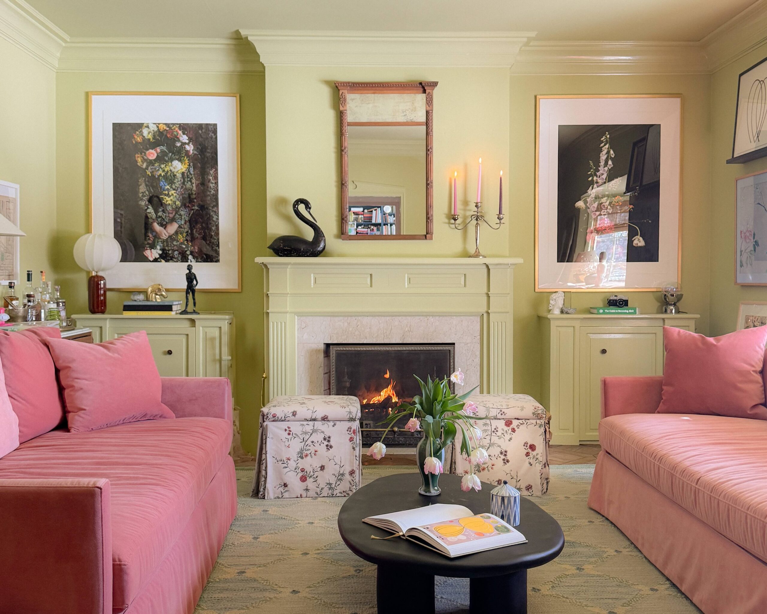
For example, blue, plum and gem tones will bring a rich but relaxing feel to a room and will work well in areas such as a study, library or living room. Bright, warm tones like yellow, chartreuse, and red can add vibrancy suitable for kitchens, dining rooms, playrooms, and even family rooms.
Color Proportions Matter
I’m going to use my house as an example. The original owners of the house selected such bold paint colors and used them so extensively that it almost becomes less of a focal point and more of an overall mood for the room. So we decided to incorporate furniture options that could withstand such harsh use of bold hues.
In our peach bedroom, we selected a pattern with pinks, blues, and greens to provide visual interest, then added neutral furniture in different textures (cotton fabric and velvet) to ground the palette and provide seating areas. In the yellow room, we brought in navy velvet chairs and bright magenta flowers to help accentuate the incredibly vibrant shade of yellow.

Bold colors need bold accents, but when they contrast, such as peach and green or yellow and navy, you’ll need to balance the proportions without creating a situation where the bold colors conflict. Getting color proportions right is where the art of interior design really shines.
Neutral IS a color
The biggest lesson for neutral color lovers is to look for colors that act as neutrals. Lavender is a great example, as is navy blue. A green with enough gray provides the vitality you crave; It also allows enough flexibility for the self-taught interior designer to make some foolproof decorating decisions that are bold but less permanent than selecting a bright, saturated paint or wallpaper color.
We should ask ourselves why we have avoided color in the first place. . . . Can we learn to think of color as a necessary part of the design equation that negates trends and instead enhances the experience we have within a space?
If there is anything to learn from this little lesson about color, it is that we should ask ourselves why we have avoided color in the first place. Is it because we are afraid of committing ourselves to something that we can “get sick of”? Can we learn to think of color as a necessary part of the design equation that negates trends and instead enhances the experience we have within a space?
I encourage you to use color theory as a guide when introducing color into your home, while incorporating your personal preferences and what suits you best in a space. Color theory is a science and also an art, which depends on your personal contributions.
I don’t know if I would be asking myself these questions if I hadn’t moved into a house with colors I would have never otherwise selected. But it has certainly changed the way I will design the rest of the house and the way I will think about color and space forever.

Kate is the founder of Wit & Delight. He is currently learning to play tennis and is always testing the limits of his creative muscle. Follow her on Instagram at @witanddelight_.

")
